Tuesday, 31 January 2017

BH3


Thank you Mary. I will do as you have advised and do agree that it will take time but hopefully i will be able to make it to at least a C grade.

Tuesday, 24 January 2017

Question 1 Planning

Made with Padlet

Evaluation question 1

Powered by emaze

Evaluation question 2

Evaluation question 3

Made with Padlet

Evaluation question 4


Created using Visme. The Free Online Presentation Tool.

Evaluation Question 1

Evaluation Question 1 by Ebrar Ozturk


Camtasia - Influences (Ebrar Ozturk) from 283goswellg on Vimeo.

Evaluation Question 2

Made with Padlet

Evaluation Question 3

Evaluation Question 4

Powered by emaze

Monday, 23 January 2017

Blogging Health Check 3

I need to catch up on some blog posts. One I complete my targets I believe my grade will go up. 

website design


My website hopefully carries on the synergy from my CD with the colour i used of black white and red and also the fonts i used for my synergy i've also used for my website as well carrying on the synergy. 


digipak change


I've decided to change my back cover as the other picture was clear it was photoshopped. As my back looked funny and it was similar picture to front album cover.  I've also slightly changed the red to a lighter one.

Friday, 20 January 2017

digipak and website feedback


Overall good feedback they are able to spot my use of synergy. They believe I should do new things and try new things on digipak and change things which is constructive criticism.

Using photoshop for my ancillary products


During the process of making my digipak, I realised that the artist name wasn't very clear or noticeable, as it blended with the background. I changed this by adding the stroke effect to the artist name. This put a white outline around it. I also changed the font type in the spine of the digipak so it could be consistent throughout. Moreover, the colour of the album name was a different shade of yellow to the rest of the text, therefore I made it a shade darker.

Advert


Website design

Advertisement


Edited inside panel


I have also made some changes to the inside panel of my digipak. In my first draft I had some effects on the album name but I realised I had to keep it consistent throughout, therefore I took off the effects. Moreover, I thought it looked a bit plain so I added the original image behind the edited image of the artist. 

Edited digipak


I have made some changes to my digipak from the feeback I got. I have made the font size for the album name smaller and added a white outline to the artist name to make it stand out. I have also moved the Parlophone logo to the triangle because it looks better there. For the spine of the digipak, I added the artist name, album name and the serial number, which makes it look more authentic. 


Photo


Blogging health check 3

Tuesday, 17 January 2017

Fonts using for my digipak


This is a rather nice font to use as it something cool, futuristic and unusual.

This font rather more simplistic however has really nice affect to it. Having looked at Tinie Tempah digipak it gave me ideas for what fonts I should use.

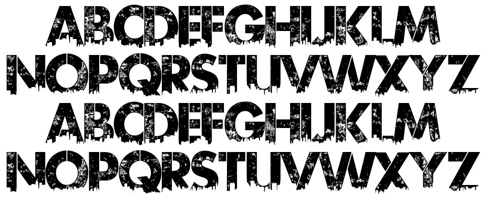
Firstly we have a Wrestlemania font which is something that will fit the genre of music chosen as tend to be out of the ordinary and unusual rather than your ordinary fonts.So therefore this is a font i'm considering because it stands out straight away as well which will make my digipak more appealing.


Second font i'm considering using is a belinda font which is once again unusual which I could implement as secondary text for like the title of the Digipak and track listing.

Third font i'm considering using is is the urban jungle which really suits are genre as urban lifestyle is prominent in our genre. So therefore we be a really good font for me to use on my digipak as it will reinforce the idea that the album is of an hip-hop genre.


Inside panel


CD inside


I decided to use this picture of warren as it wouldn't look good on the front, as it's difficult to see his face, this is why it works on the inside, as viewers have already seen his face twice before opening the cd. I wanted to keep the inside simple, like the outside. I inverted the colours of the artist name and album name as with the background here, black font stands out more than white font.

CD improved


This is the improved version of my CD. I've rearranged the institutional information, altered the song list and added some more shadow.

digipak flatplan feedback and website flat plan


They liked my idea for my flat plan however they believe I should apply pictures in certain places like the front and back. They also believe my colour should be evenly spread out so i carry on my digipak as well as my website. I look to improve it significantly before my final product.

Friday, 13 January 2017

choices of photos chosen for digipak


These are photos I took during my artist Photoshoot these photo stood out as it will be easy to implement on my digipak due to photoshop. A number of these photos convey the use of synergy due to clothing and the inclusion of the hat which is our main synergy.